Studio: Studio Basics
Purpose
This document covers the basics of Studio in Odoo 15, which is an app that allows you to customize forms and pages throughout Odoo.
Important!
Use Studio with Caution
If you have a lot of customizations to your pages and forms, it's best practice to make those changes in code rather than via Studio. Studio modifications can cause problems when it comes to upgrading your Odoo instance to a newer version, or implementing future dev. Additionally, changes made in Studio and data added through Studio fields, can be easily overwritten by other users. For assistance in adding changes to code, please contact us!
Good to Know!
Opening, Saving, + Exiting Studio
Studio can be toggled on from any page by clicking the Studio tools icon.

All changes are saved as you're making them.
To exit Studio, click CLOSE on the top-right of the screen.
Processes
Adding a Background Image
To get started, navigate to the home page of your Odoo instance. Once there, toggle Studio on by using the tools icon on the top-right of your screen.

Your screen colors and top menu bar will change in appearance. Go to Customizations > Change Background.

This will bring up your computer's file browser. Select a new background and apply it. The page will reload with your new image. To keep these changes, click Close.

To remove this background image, go to Customizations > Reset Default Background.

Click OK to confirm.

Studio Menus
Toggle studio on by clicking the Studio tools icon.
![]()
Doing so enables several different editing options on the page, and those options will change based on the page you're on. Let's navigate to the Contacts app.

This will show a sample record in the default view for that app.

Top Menu Bar

The first section of the top menu bar mimics the app itself and will take you to the respective pages with Studio enabled.

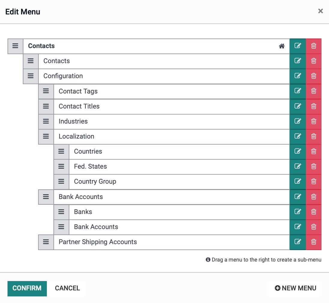
Edit Menu: This opens the Edit Menu modal window. Here you can edit the menu items and change how they're organized. You also have the option to add a NEW MENU from this section.
If you've made changes, click CONFIRM.
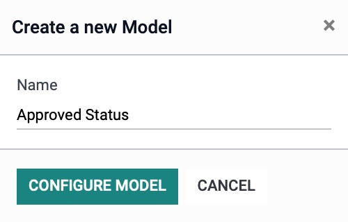
New Model: Here you can create a new model. When clicked, a modal window will display where you'll enter the model name, then click Configure Model.
We will not be going into how to create and configure models in this documentation.
Views

On the top right, you'll see the different available views for this record. Changing the view allows you to modify the content on that view, respectively.
Form: This will open the form view.
List: This will open the list view.
Kanban: This will open the kanban view.
Map: This will open the map view.
Activity: This will open the activity view.
Search : This will open the search view, allowing you to edit the Filters, Groups, and Autocompletion Fields.
Additionally, you can click Views to see additional views that are not activated.

Activate a View
Views that aren't active are shown in grayscale. If you hover over the thumbnail, you'll see an Activate view banner. You can activate a new view by clicking on it.
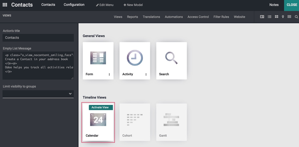
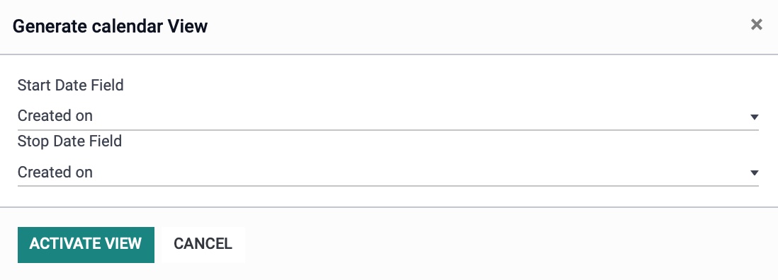
This will bring up modal window where you'll futher configure the view. The fields on this modal will vary based on the view selected. Enter the configuration details, then click Activate View.
Disable a View
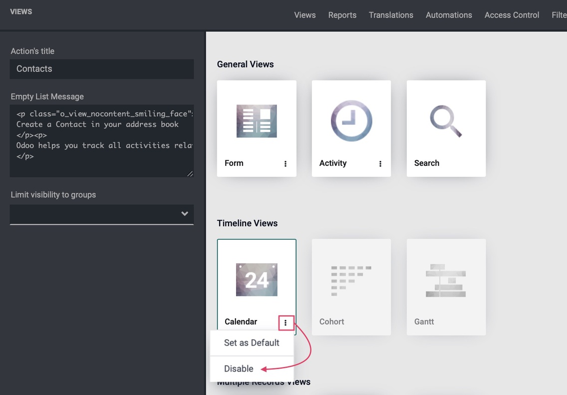
You can also disable the view by hovering over the thumbnail, clicking the ellipsis menu, then selecting Disable.
Good to Know!
Not All Views Make Sense
There are times when it just doesn't make sense to activate a view. For example, activating the Graph view on Contacts would not likely provide very useful data because Contact records alone don't have useful metrics.
Reports
The Reports menu opens a page containing the PDF report templates for the app, respectively.

From here, you can click Create to add a new report. This brings up a modal window where you'll select the type of report you want to create.

We will not be going into how to create and configure reports in this documentation.
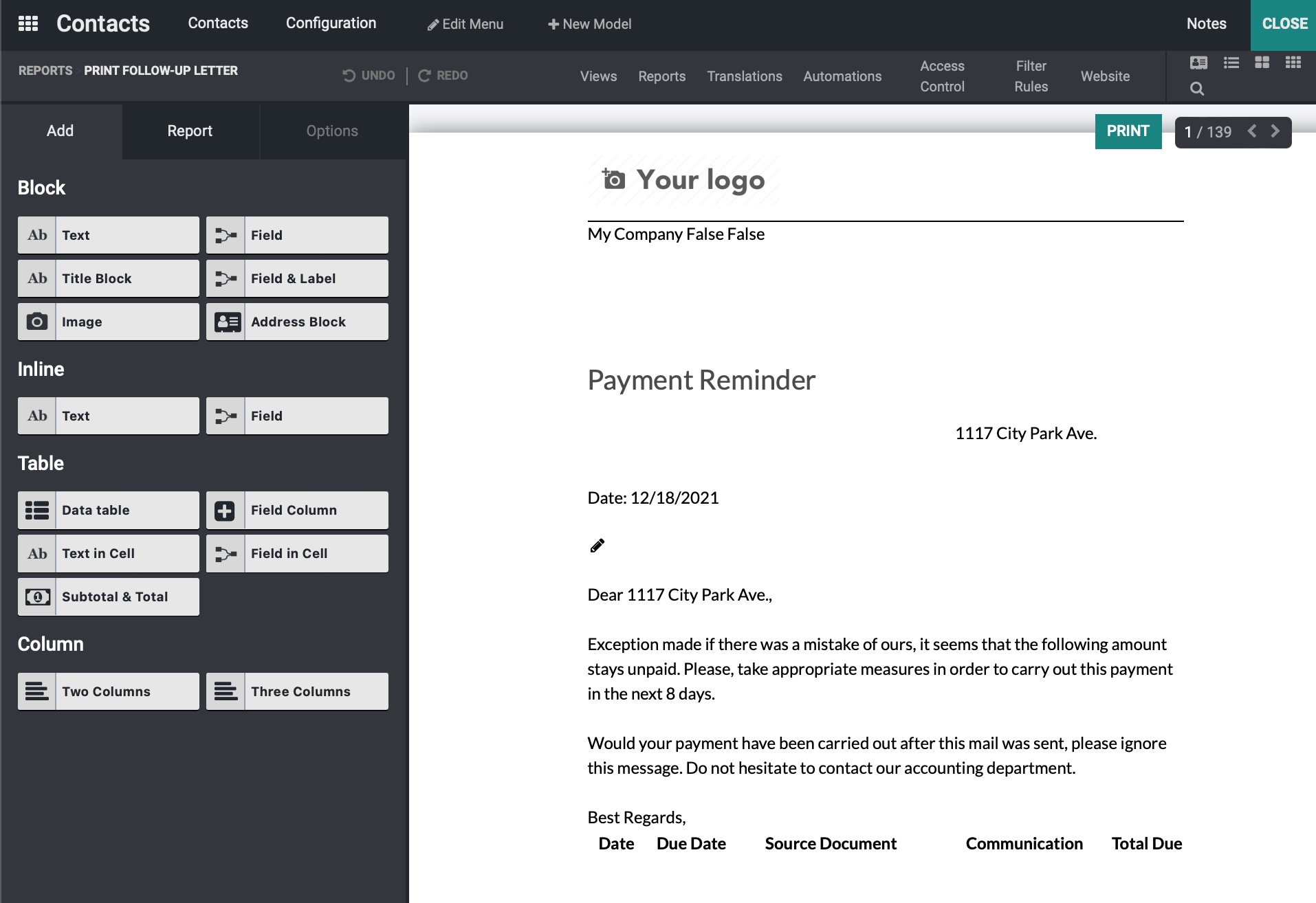
To edit a report, simply click it from the kanban view.

This will open up the editor.
Translations
The Translation view will give you a list of translated fields.
Automations
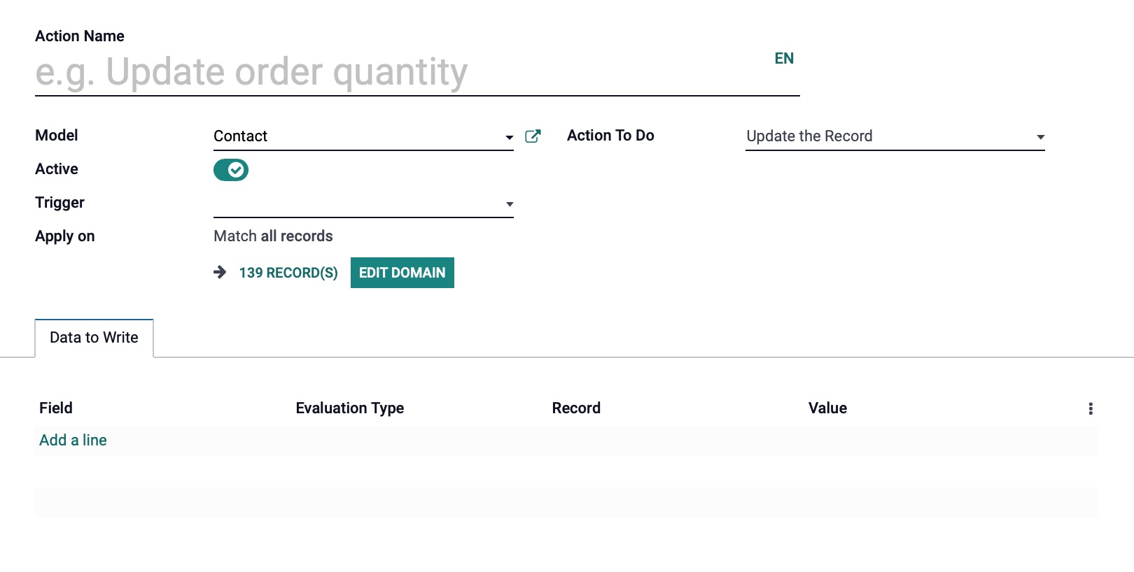
The AUTOMATIONS menu opens a list of existing Automations (i.e. Server Actions).

To edit an Automation, click the record to open it in form view.

To add Automations for use within the respective app, click Create.
We will not be going into how to create and configure Automations in this documentation.
Access Controls
The Access Controls menu option will show a listing of existing permissions for this application.
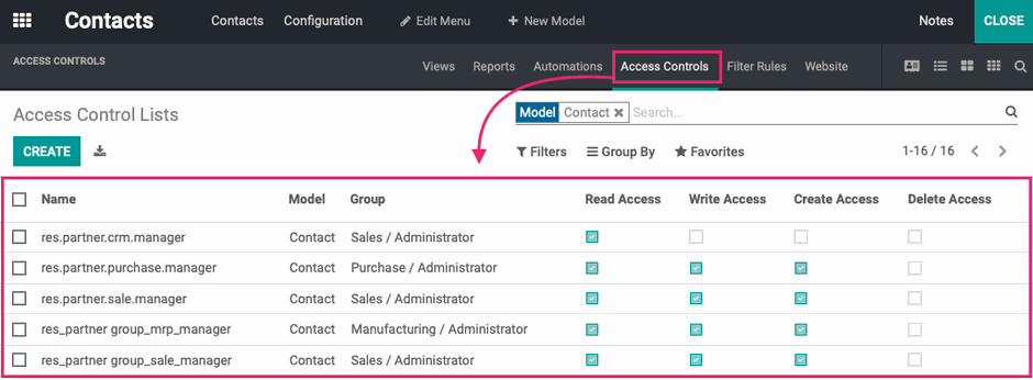
Here you can modify existing permissions after opening a permission by selecting/deselecting the booleans on each line, respectively.
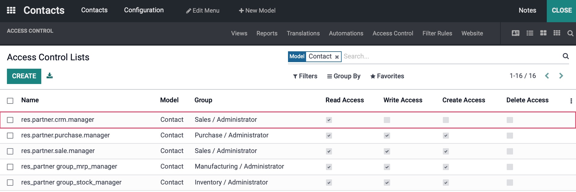
To add a new permission set, click CREATE.

We will not be going into how to create and configure Access Controls in this documentation.
Filter Rules
The filter rules menu opens a list of existing Filter Rules configured for the front-end (Portal) view.

To edit a Filter Rule, click the record to open it in edit view on the front-end of the website.

To add Filter Rules for use within the respective app, click Create.

We will not be going into how to create and configure Filter Rules in this documentation.
Website
The forms menu opens a listing of existing Forms configured for the front-end (Portal) view.
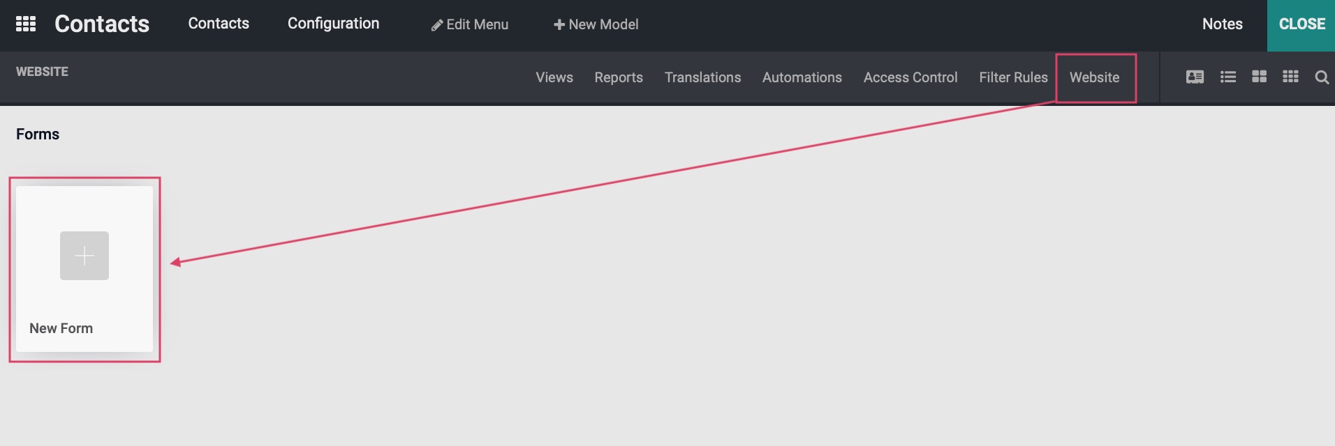
To edit a Form, click the record to open it in edit view on the front-end of the website. To add Form for use within the respective app, click Create.

We will not be going into how to create and configure Forms in this documentation.
Studio Editor
Now, let's explore how to actually edit in Studio. To see the features in the Editor pane, first click views, then select Form.

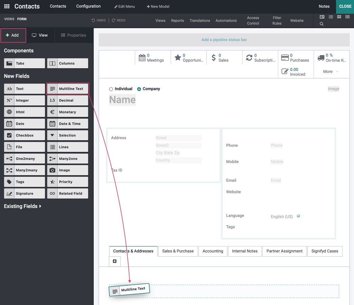
This opens the Contact record form, and you'll see the editor pane on the lefthand side. This pane is comprised of three tabs: Add, View, and Properties.

Add Tab
The options on the Add tab allow you to add fields to the form.
This tab shows elements in different categories:
Components: These are meant for organizing your data, such as a new Tab set or Columns.
New Fields: These are configurable fields that are not already available on the form. They have a basic data-set but should be modified in properties to meet your specific needs.
Existing Fields: These are fields that are already visible in the view.The data they display is preconfigured but can be modified in properties.
To add a field, simply drag-and-drop it where you'd like it to be placed. Once added, the PROPERTIES pane will open. This is covered in the next section.
Properties Tab
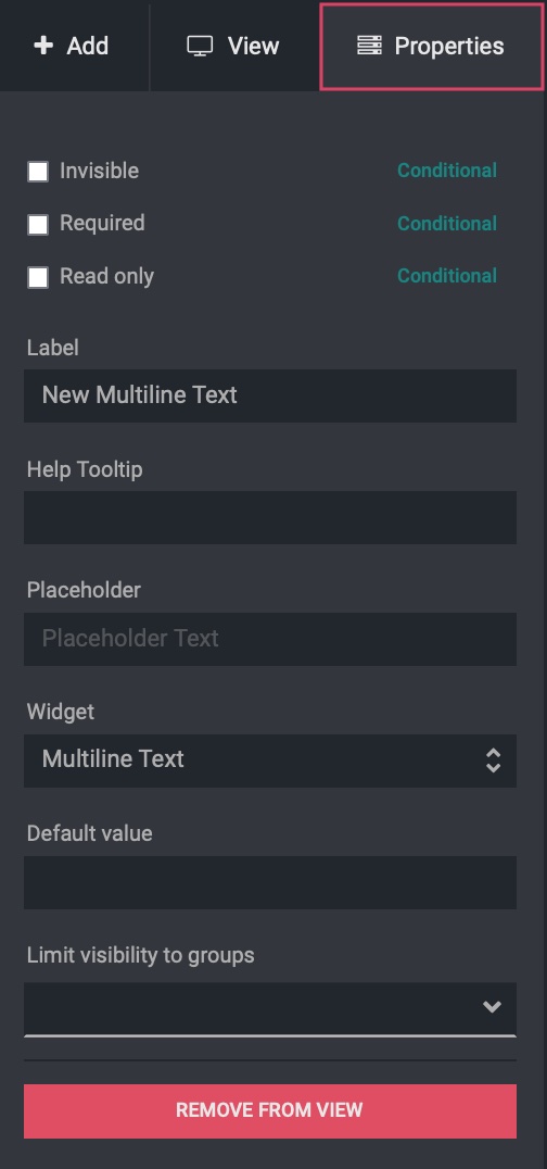
The Properties tab is available any time you have a form element selected. This is where you'll enter the settings and configuration for the field you've added.
The fields on this tab will vary, but the following are common to text input fields.
Invisible: When selected, this form field will be invisible.
Required: When selected, this form field will require selection or input before saving.
Read Only: When selected, this form will be for display only. The user cannot modify the selection or input.
Label: The visible name of the field. Note that some fields will not display a label, such as multiline text areas. In these cases, use the Placeholder text for this purpose.

Help Tooltip: The text displayed when the field is hovered.

Placeholder: The muted text displayed in the field which is overwritten when the user starts to type.

Widget: This will be used to define the functionality of the field.
Default Value: The default value for a field; this is used to ensure a basic input or to pre-populate the most common input.

Limit Visibility to Groups: The group(s) that have permission to view this field.
REMOVE FROM VIEW : This removes the field from the form after confirming.
Views Tab
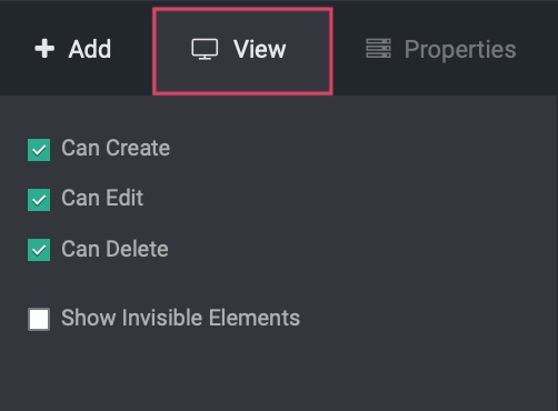
The options on the View tab are used to enable/disable other features related to the current view.
Can Create: Enabling this will allow the user to create a new record from this form view. Disabling this removes the Create button and record creation is disabled.
Can Edit: Enabling this will allow the user to edit a record in this this form view. Disabling this removes the Edit button and editing is disabled.
Can Delete: Enabling this will allow the user to delete a record from this view. Disabling this removes the Edit button and editing is disabled.
Show Invisible Elements: Enable this to display elements that aren't in the default view, such as the "Archived" banner. This allows you to modify that element without needed to otherwise trigger it.
Adding Key Features
Within a view, you'll also have the option to add other key features in the editing window.
Add a Pipeline Status Bar
Click Add a Pipeline Status Bar to add a bar showing the different stages of a record.

This brings up the Field Properties modal where you can rearrange, enable, remove values.
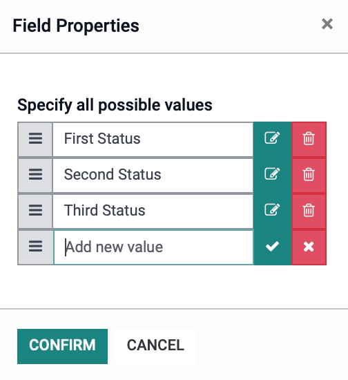
If you need to add a new value, fill in your value name and then click . If you no longer want to keep the value, click .
When you are done, click CONFIRM. and the new status bar will display.

Add a Smart Button
Hover over the smart button section and click the icon.

This brings up the Add a Button modal window where you'll enter a label, select an icon, and a related field.
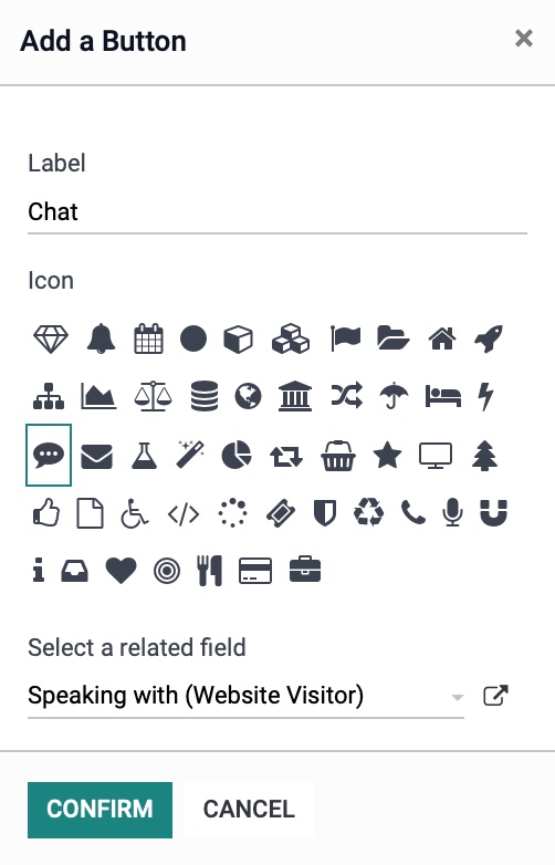
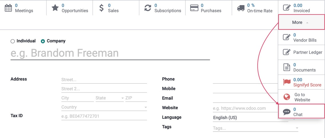
Click CONFIRM when done, and then Close Studio. When you dropdown the More menu options, you will see the new smart button that was created.
